



Ten years after founding Yates Desygn, Bryan and Mike Yates are unveiling a new visual identity for our Dallas-based interior design studio. Created in collaboration with O&H Brand Design, the Yates Desygn rebrand introduces a distinctive new logo, a richer color palette, and a visual language that reflects the studio’s personality today.
At the heart of the identity is an unexpected but familiar face: Lady Bird, Bryan and Mike’s beloved dachshund and a much loved presence in the studio. Her new winged silhouette brings a playful touch to an identity rooted in craftsmanship, sophistication, and timeless design.
This evolution is reflective decade of creative growth, shaped by the people, experiences, and relationships that have defined Yates Desygn, with a clear sense of where the studio is heading next.
Ten Years In, a New Chapter
When Bryan and Mike first established Yates Desygn in Dallas, they were building their reputation from the ground up. New to the city and without an established network, they understood the importance of presenting a confident, considered image.
Their original branding reflected that ambition. Clean, restrained, and predominantly monochromatic, it provided a visual foundation for a young studio determined to establish itself in the design community.
A decade later, much has changed.
The studio has grown, its portfolio has become increasingly diverse, and its approach to design has evolved through years of experience, travel, and collaboration.
The early years called for a carefully defined visual identity. Today, Bryan and Mike have the confidence and creative freedom to express more of their personalities, something that has increasingly influenced both their work and the relationships they build with clients.
Their interiors have also evolved. Greater experimentation with color, materials, and unexpected details reflects a studio that has become increasingly comfortable exploring new creative territory.
Throughout that evolution, Yates Desygn has remained committed to creating highly personal interiors shaped by each client’s individual tastes and lifestyle. That philosophy has given the studio the freedom to develop an increasingly varied body of work, without being confined to a particular aesthetic.
Yates’ tenth anniversary presented a natural opportunity to reflect on those changes, celebrate the journey so far, and consider how the studio wanted to present itself in the years ahead.
The new identity captures the confidence, creativity, and personality of Yates Desygn today, while leaving room for everything the next decade might bring.
“I think our new look really plays to who we are today and how not only do we do great work, but we have fun while we’re doing it.”
Bryan Yates
When the Designers Became the Client
For Bryan and Mike, choosing the right creative partner was an important first step.
Having spent years guiding clients through their own design journeys, from new construction interior design to extensive home renovations, they understood the value of working with specialists whose expertise and creative judgment they could trust.
Their search led them to O&H Brand Design, a Dallas-based branding and creative agency led by founder and Executive Creative Director Brian Owens.
A strong recommendation initially brought O&H to their attention, but it was the agency’s portfolio that convinced them to explore the relationship further.
Each project felt individual, with its own visual identity and personality. It was an approach Bryan and Mike recognized from their own work, where the creative direction is shaped by the people and spaces involved.
The similarities continued during their first conversations with Brian, particularly as he explained the agency’s research led and collaborative approach.
With a creative partner selected, Bryan and Mike found themselves in unfamiliar territory.
For once, they were the clients.
They were now experiencing the anticipation of a design presentation, the excitement of discovering unexpected possibilities, and the responsibility of making decisions they would live with for years to come.
O&H presented a range of creative directions, each supported by research and a clear design rationale. Bryan and Mike found themselves responding to the stories behind the concepts, sometimes discovering an appreciation for a direction they hadn’t initially considered.
The decision required them to imagine how each identity would work across different applications, from their website and printed materials to products and collaborations that might emerge in the future.
There was also the question of longevity. They wanted an identity they could feel proud of for the next ten years, and potentially much longer.
The experience closely mirrored the creative journey they regularly guide their own clients through.
When developing interiors, Bryan and his team encourage clients to consider how a design will function and feel over time, supported by the studio’s expertise and a carefully developed creative process.
Now they were placing that same trust in O&H.
For Brian Owens, working with Yates provided an opportunity to explore ideas with clients who understood the creative process and were willing to embrace unexpected directions.
Their openness allowed the O&H team to develop and refine concepts with considerable creative freedom, supported by constructive feedback from Bryan, Mike, and the wider Yates Desygn team.
That shared trust became one of the defining qualities of the collaboration.
“Nothing is arbitrary. It’s really intentional.”
Bryan Yates
Different Disciplines, Shared Principles
Interior design and brand design require different skills, but throughout their collaboration, the Yates Desygn and O&H teams discovered a remarkable amount of common ground.
Both disciplines begin with understanding people. Their personalities, preferences, ambitions, and the way they want to experience the finished design all influence the creative direction.
For O&H, the process began with an extensive exploration of Yates Desygn as a business. The goal was to understand its portfolio, relationships with clients, and the qualities that made the Yates distinctive.
Designer Liliya Kvatsabaya recalled the importance of that early research.
That understanding shaped a wide range of initial concepts, with different members of the O&H creative team exploring their own interpretations of the brief.
Led by Brian Owens, the project brought together Creative Director Brian McAdams, Designer Liliya Kvatsabaya, and Account Supervisor Caro Angers.
When it came time to present their ideas, Bryan and Mike were struck by the way each creative was encouraged to explain their own work by sharing the inspiration, and finer details behind their proposals.
Brian Owens describes this approach as an important part of O&H’s creative culture. Different backgrounds, experiences, and perspectives bring greater depth to the exploration, often revealing possibilities that no single designer would have developed alone.
It’s a philosophy shared by Yates Desygn.
While Bryan leads the creative vision for every project, designers throughout the studio contribute their expertise and ideas. That collaborative spirit has helped shape the studio’s work and was reflected in the way the team participated in the rebranding process.
Senior Designer Georgina Valenzuela, who had been with Yates Desygn for five years, voiced strong reservations about one of the identities Bryan and Mike were considering. Her perspective contributed to the conversations that ultimately helped the team settle on their final direction.
For O&H, working with another group of designers brought an additional level of creative understanding.
Caro Angers recalled how Bryan and Mike picked up on details that clients from other industries might never notice, including subtle typographic relationships, letter spacing, and the proportions of individual elements.
Liliya similarly appreciated working with clients who could recognize the intention behind individual design decisions, often without requiring a lengthy explanation.
The parallels with interior design became increasingly apparent. Every carefully considered detail contributes to the character of a space, just as typography, color, and composition shape the overall impression of a visual identity.
For both studios, a successful creative process depends on the quality of the thinking behind the work, the contributions of the wider team, and the relationships that make genuine collaboration possible.
“The process really started before anyone picked up the pencil.”
Liliya Kvatsabaya, Designer, O&H Brand Design
A Familiar Face, a New Signature
Anyone who has visited the Yates Desygn studio will likely already be familiar with Lady Bird.
Bryan and Mike’s beloved dachshund is a regular presence in the office, greeting visitors, entertaining the team, and taking her unofficial responsibilities as the studio’s head of HR very seriously. She’s become such a recognizable part of daily life that some vendors stop by specifically to see her.
So when O&H began exploring what might make the Yates Desygn rebrand distinctive, Lady Bird naturally found her way into the conversation.
For a studio known for its sophisticated interiors, incorporating a dachshund into a luxury brand identity might seem an unexpected creative direction. Yet the idea captured something important about Bryan and Mike: their warmth, humor, and the genuine pleasure they take in the relationships formed through their work.
O&H Designer Liliya Kvatsabaya began exploring how Lady Bird could become a recognizable symbol for the studio. Her initial concepts underwent considerable development, with the wider creative team contributing to the refinement of the illustration.
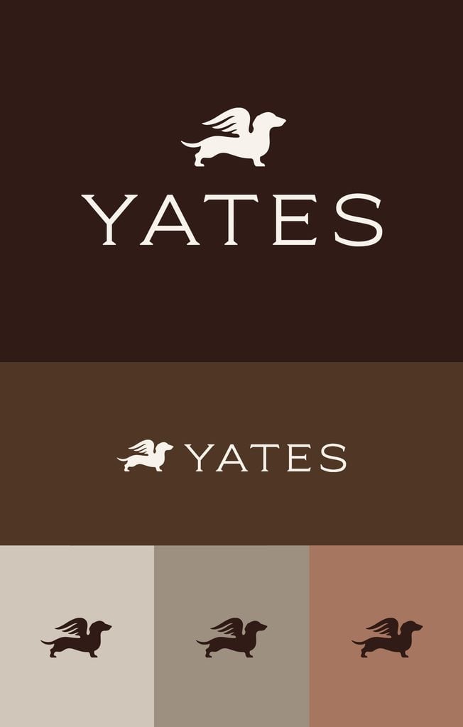
The final design presents Lady Bird as a winged dachshund, rendered in an elegant silhouette that draws inspiration from traditional emblems and heritage branding. There’s a sense of history and permanence to the mark, balanced by the unmistakable personality of its subject.
O&H Account Supervisor Caro Angers remembers seeing Liliya’s early concepts taking shape in the studio and immediately developing a soft spot for the idea.
Caro recalls the excitement when Bryan and Mike ultimately selected the Lady Bird direction. It had been a favorite within the O&H team, and the finished identity felt particularly appropriate for the people they had come to know through the collaboration.
For Brian Owens, the illustration also captured an important balance in Yates Desygn’s personality. The studio approaches its work with considerable rigor and attention to detail, while maintaining a welcoming atmosphere and a willingness to have fun.
That duality gives the emblem its charm. Lady Bird feels entirely at home beside the classical typography and refined color palette, while introducing an element of personality that makes the identity memorable.
For Bryan and Mike, there’s also something deeply personal about giving Lady Bird a permanent place in the studio’s visual identity.
As they look toward the next decade, her likeness will appear across the website, printed materials, packaging, and potentially future product collaborations.
A familiar and much loved member of the Yates Desygn family has become the symbol of its next chapter.
“I always quietly have my top picks. And I love Lady Bird from the beginning.”
Caro Angers, Account Supervisor, O&H Brand Design
The Details That Make the Difference
Look closely at the new Yates identity and you’ll discover a series of carefully considered details that bring the individual elements together.
Perhaps the most charming is the relationship between Lady Bird’s feet and the serifs of the YATES wordmark. The delicate curves and proportions of the illustration subtly echo the letterforms, creating a visual connection between the emblem and the typography.
It’s the kind of detail that can easily go unnoticed, yet contributes to the overall balance and character of the design.
For Bryan and Mike, discovering these connections during O&H’s presentations was particularly rewarding. They recognized a familiar approach to craftsmanship, where individual decisions contribute to a cohesive result.
In their own interiors, similar considerations influence everything from architectural proportions and material transitions to the selection of furniture, lighting, and finishing touches.
The studio’s approach to furniture, furnishings, and styling reflects that same attention to how individual elements relate to one another. Scale, texture, craftsmanship, and placement are all carefully considered to create spaces that feel balanced and personal.
During the branding process, Bryan and Mike found themselves appreciating those familiar principles through an entirely different creative discipline.
The new wordmark also reflects the studio’s growing confidence in its identity.
With its distinctive serif typography and refined proportions, YATES takes center stage, creating a recognizable signature that can stand independently across different applications.
The broader typographic system supports this with a combination of expressive editorial headlines and understated supporting text. This allows the identity to move comfortably between the website, printed communications, and other branded materials.
Throughout the process, O&H explored how each element would function in context. Concepts for the Yates Desygn rebrand were presented across realistic applications, including the studio’s own interiors, helping Bryan and Mike understand how the identity would feel beyond a presentation screen.
Caro Angers recalls the satisfaction of seeing the Yates team recognize the subtleties in the work, from the curves of Lady Bird’s illustration to the relationships between individual letterforms.
These details reflect the care invested in the finished identity and the creative understanding shared between the two studios.
For Yates Desygn, that attention to detail has always been a defining part of the client experience. The same principle now runs through the studio’s own branding, creating a visual identity that rewards a closer look.
“And I love how the serifs are her tiny little feet. They kind of match.”
Mike Yates
A Warmer Expression of Yates Desygn
For much of its first decade, Yates Desygn presented itself through a predominantly black-and-white visual identity. The restrained palette allowed the studio’s interiors to take center stage, with project photography providing the color, texture, and personality.
As the studio evolved, however, Bryan and Mike began embracing a richer range of colors in their work. Their travels, growing team, and increasingly diverse projects brought fresh creative influences, while their confidence in expressing the studio’s personality continued to grow.
The new brand identity offered an opportunity to bring some of that character into Yates Desygn’s own visual language.
During the creative process, O&H encouraged Bryan and Mike to consider whether the original monochromatic palette still reflected the people behind the business.
The resulting palette draws inspiration from natural materials, rich woods, and the timeless interiors that have long influenced the studio’s work.
At its foundation is Lady Bird Brown, a deep chocolate shade that lends the identity warmth and depth. Its name also pays a fitting tribute to the dachshund who inspired the new emblem.
The supporting colors continue the connection to the materials and textures familiar to interior design.
Saddle introduces another rich, earthy brown, while Travertine and Driftwood provide softer, more neutral tones. Clay brings a muted warmth, and Linen offers a delicate, creamy background that allows the typography, illustrations, and photography to stand out.
Together, the six colors create a versatile palette that feels both established and inviting.
The material references extend into the physical expression of the brand. For printed applications, O&H’s guidelines specify Crane’s Lettra Pearl White paper as the preferred representation of Linen, adding a tactile quality that complements the visual identity.
Across the new website, the warmer backgrounds and expressive typography create a welcoming setting for Yates Desygn’s portfolio. The colors introduce greater personality while remaining subtle enough to complement interiors ranging from traditional residences to contemporary spaces.
For Bryan and Mike, the change feels particularly appropriate for a studio whose client relationships often span several years. The work is personal, collaborative, and built on mutual trust, with plenty of room for creativity and enjoyment along the way.
The new palette brings some of that spirit into every expression of the Yates Desygn brand, giving it a warmth and individuality that feels entirely at home with the people behind it.
“O&H even made the point ‘You’re not a gray, black and white kind of firm’.”
Bryan Yates, recalling O&H’s feedback
Designed for the Next Decade
With ten years behind them, Bryan and Mike are already thinking about what the next chapter of Yates Desygn might look like.
Their ambitions extend beyond the studio’s established residential and hospitality projects, with opportunities for product development, creative partnerships, and new ways to share the Yates Desygn aesthetic.
These possibilities were an important consideration throughout the branding process. The new identity needed the versatility to work across a growing range of applications, from the website and printed materials to packaging, publications, and products that have yet to be imagined.
For Bryan and Mike, there’s a particular appeal in creating a brand with a sense of heritage, something recognizable, enduring, and capable of developing its own legacy.
The new YATES wordmark and Lady Bird emblem provide a foundation for that ambition. Together, they establish a distinctive identity that can become increasingly familiar as the studio explores new creative opportunities.
Some applications are already taking shape, including plans to incorporate Lady Bird into the lining of Mike’s custom suits. Others, from branded gifts and accessories to potential product collaborations, are still being explored.
O&H has equipped the studio with a comprehensive visual system and clear brand guidelines, giving the team the flexibility to carry the identity into these new settings while maintaining its consistency and character.
As Yates Desygn enters its second decade, the focus remains on the qualities that have shaped its first: exceptional design, meaningful relationships, creative collaboration, and an unwavering commitment to quality.
With a new identity that captures the studio’s personality and ambitions, Bryan, Mike, and their team are looking forward to what comes next.
“We’re looking for legacy at this point.”
Mike Yates